
Brand Identity • Social Content • Photography
Based in Central Oregon, Stump'd Tree Professionals provides tree care and removal services throughout Bend, Sisters, and Redmond.
As the business grew, owner Nate wanted to create a more cohesive and recognizable visual identity across the brand's customer-facing channels. I helped refine the existing brand and build out the creative assets for STP’s use across social media, digital marketing, and other promotional materials.
THE PROJECT
I worked with STP to develop a more cohesive visual system while maintaining the brand's existing personality — approachable, local, and a little playful.
Deliverables
Brand style guide
Logo variations
Social media graphics
Brand photography
Supporting visual assets
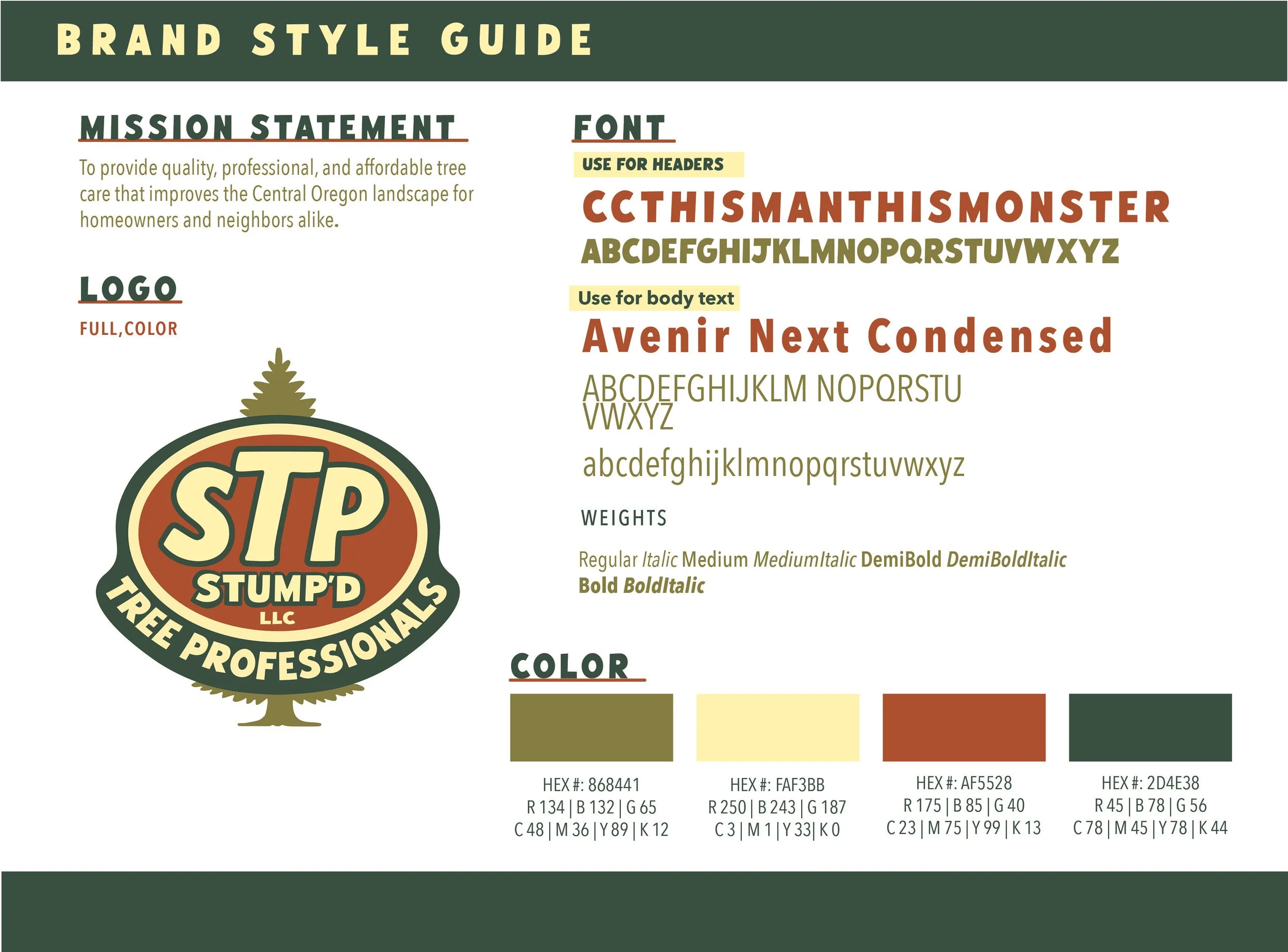
Brand style guide
I created a streamlined brand style guide to give STP a clear reference for using its visual identity consistently across marketing materials.
The guide brings together the brand's typography, color palette, logo usage, imagery, and other visual elements into one easy-to-use system.
Note: The original full-color logo was designed by STP's owner, Nate.
Logo Design
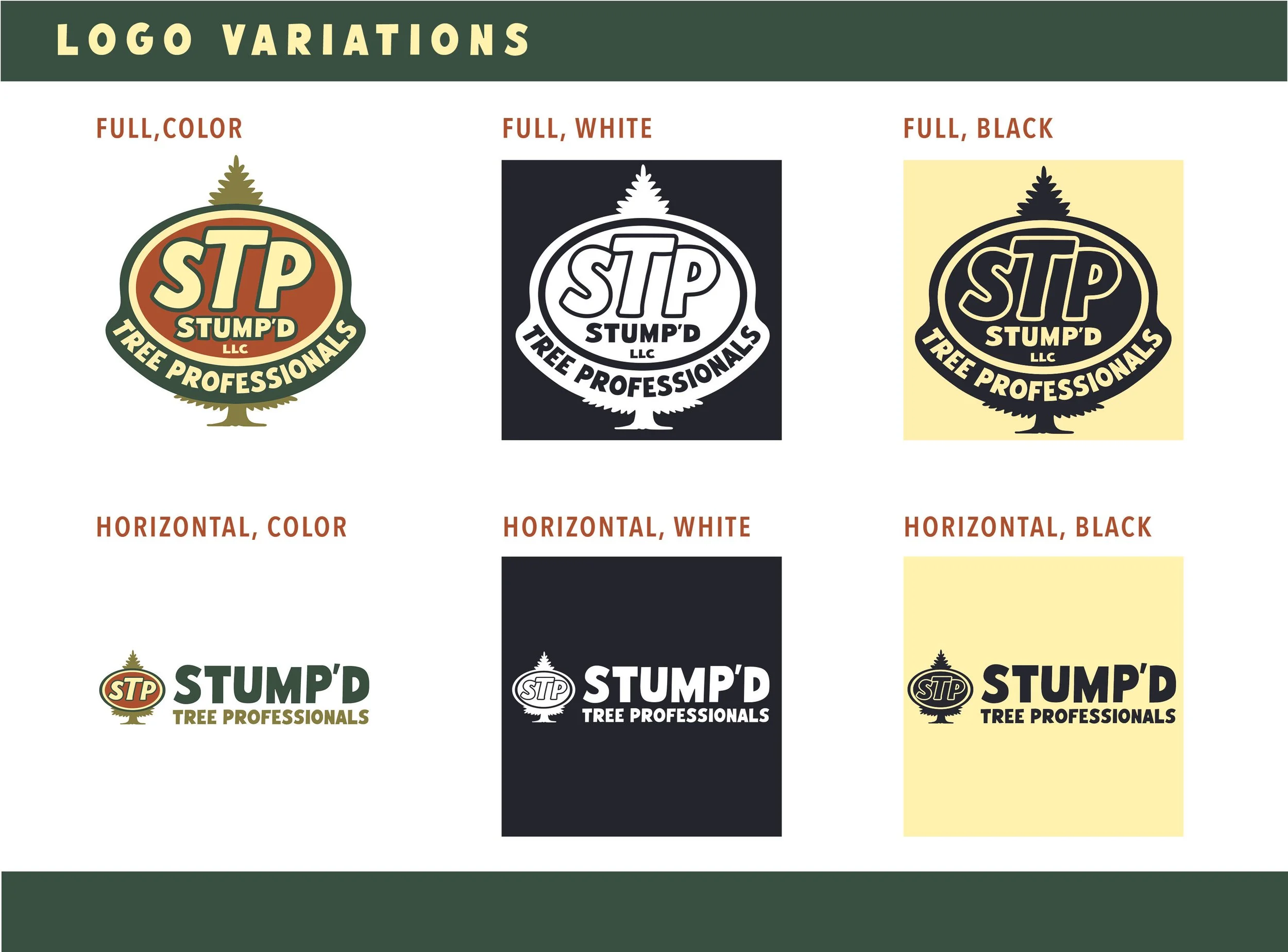
STP's original full-color logo was designed by Nate. I expanded the existing identity by creating additional logo variations for greater flexibility across different applications.
This included:
White and black logo variations
An alternate horizontal logo
White and black versions of the horizontal logo
The result is a more flexible logo system that can work across digital, print, photography, and other brand applications.
Social content
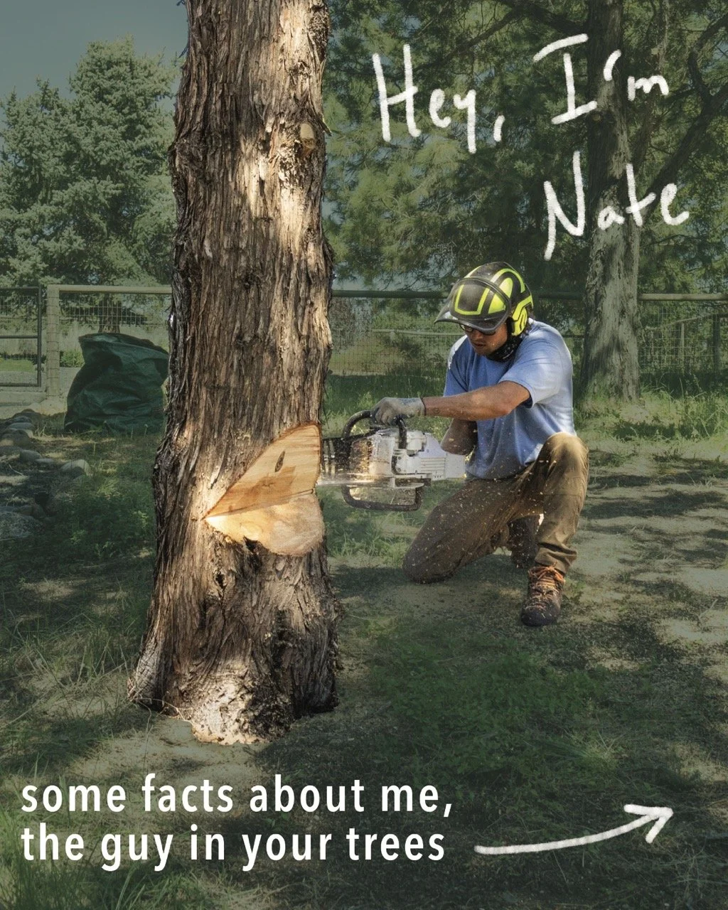
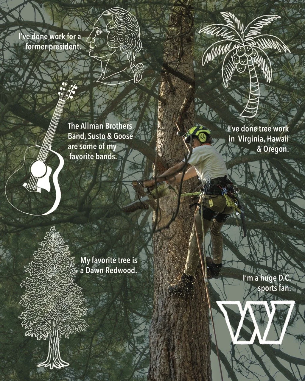
STP wanted to introduce its audience to the person behind the business while maintaining the company's casual, playful personality.
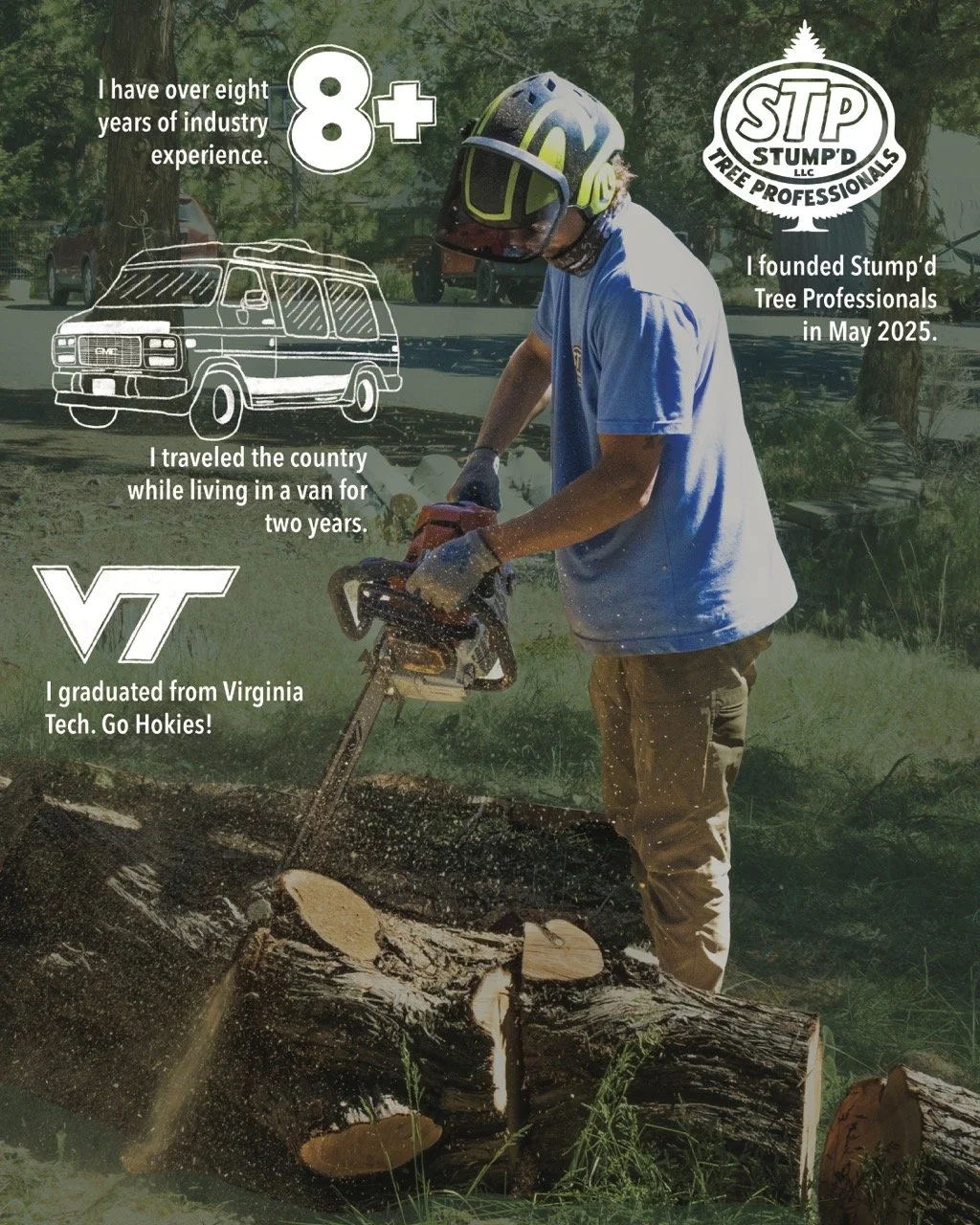
I developed a three-part Instagram carousel designed to introduce Nate to prospective customers in a way that felt personal and true to the brand.
The graphics were designed in a 4:5 format for Instagram and paired with brand photography to create a social post that felt more like STP than a traditional service-business advertisement.
BRAND photography
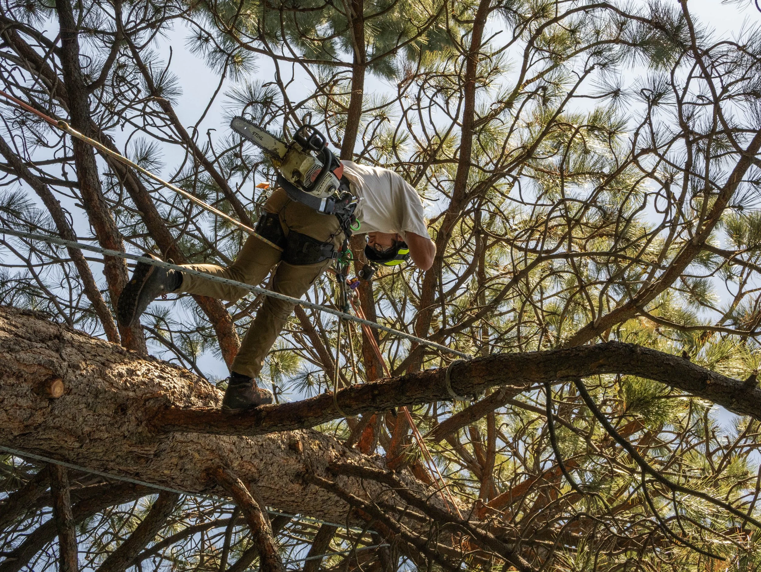
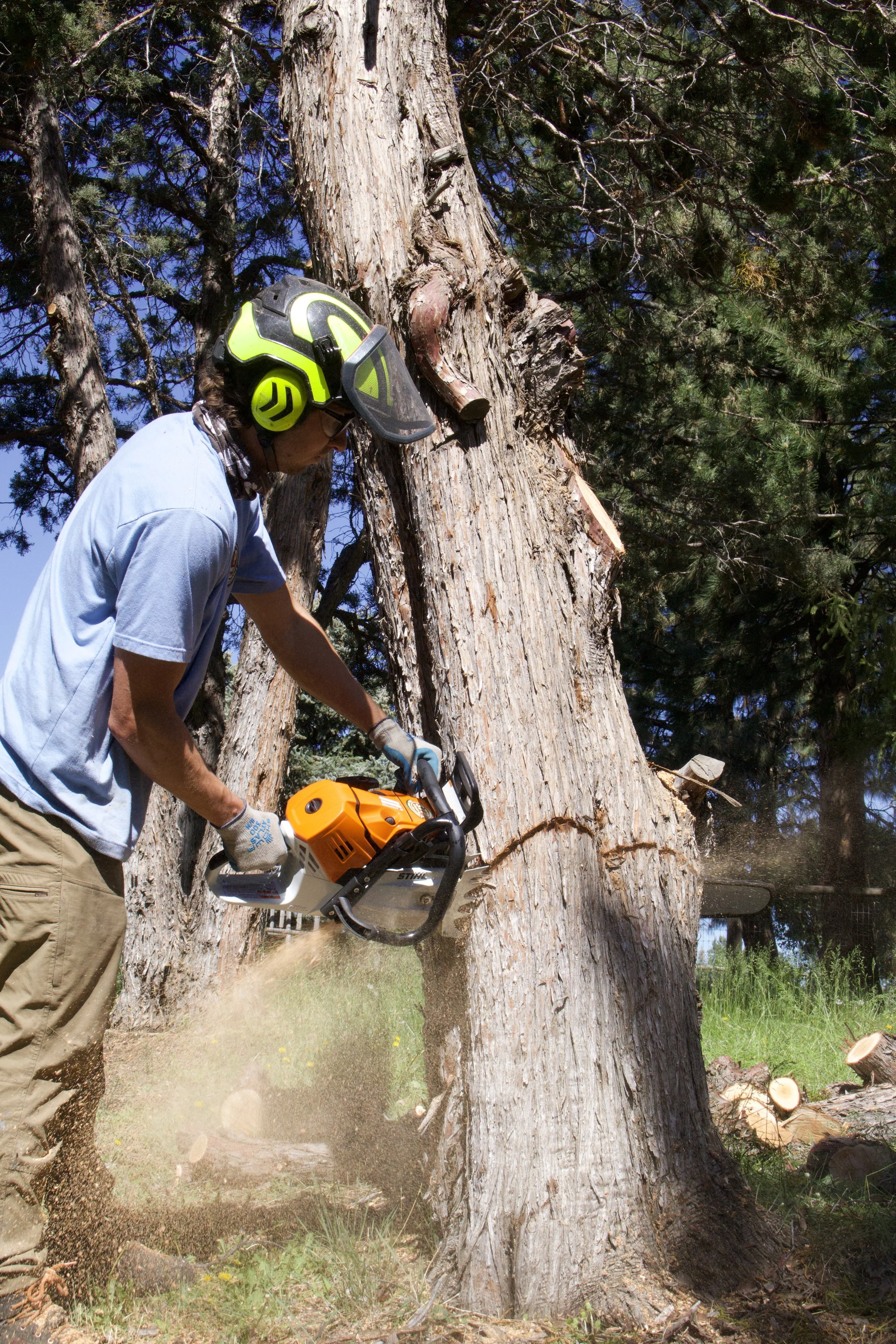
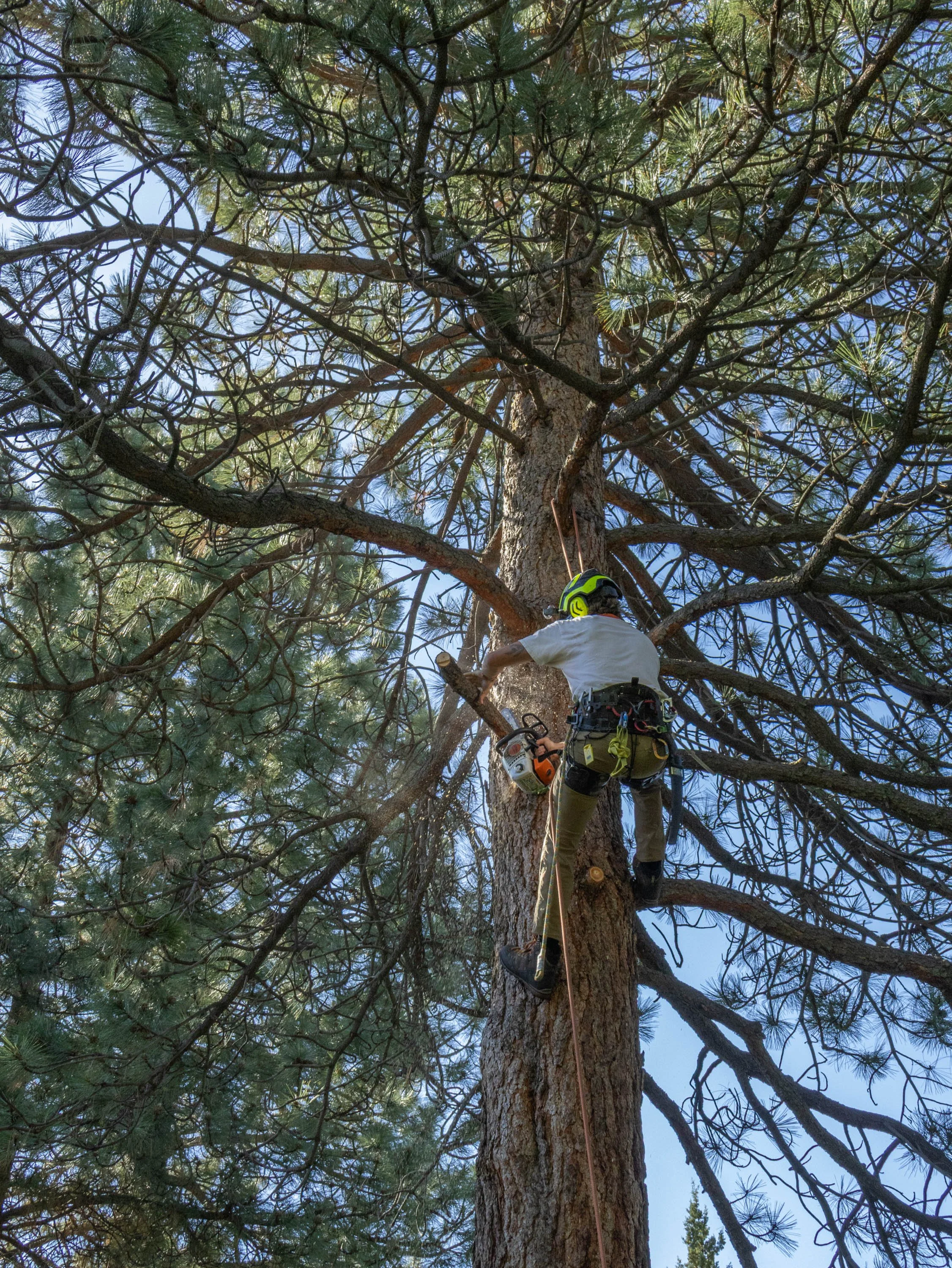
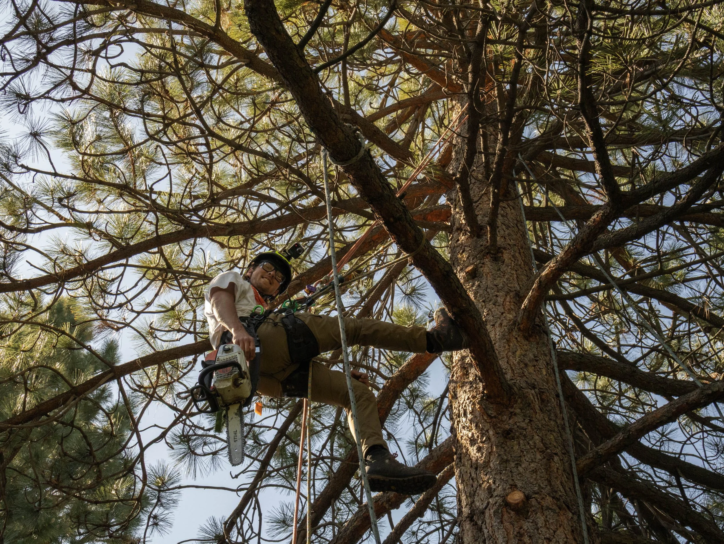
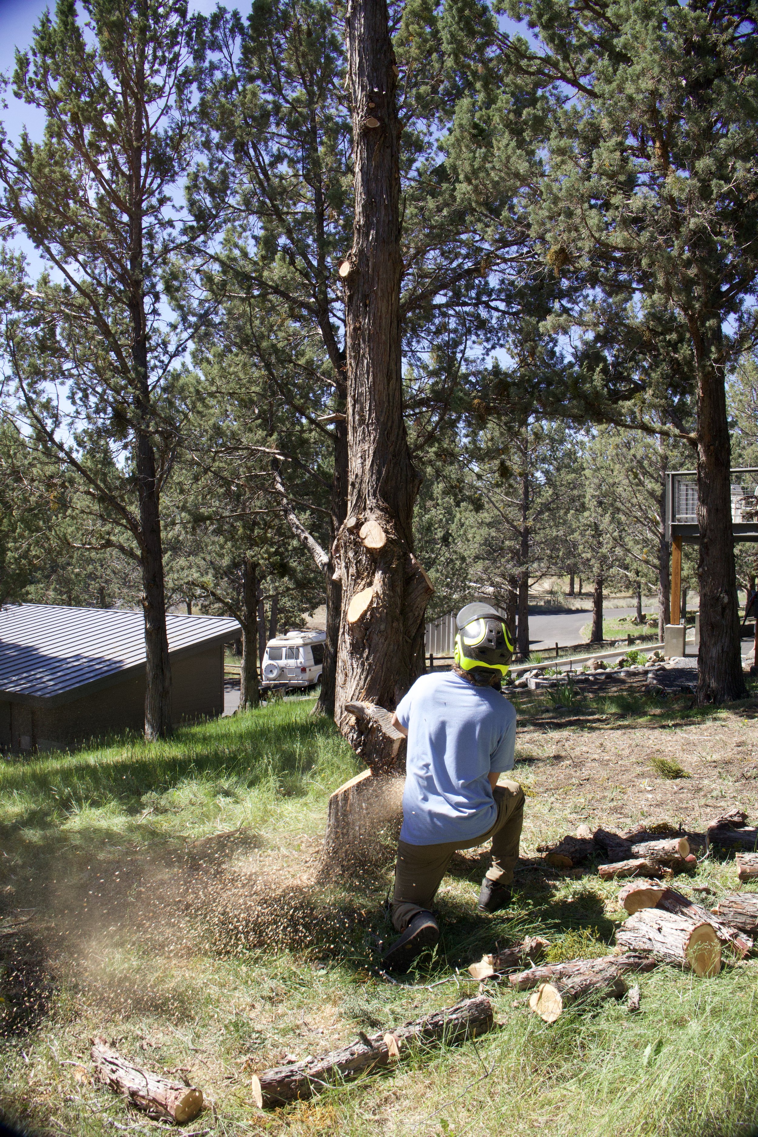
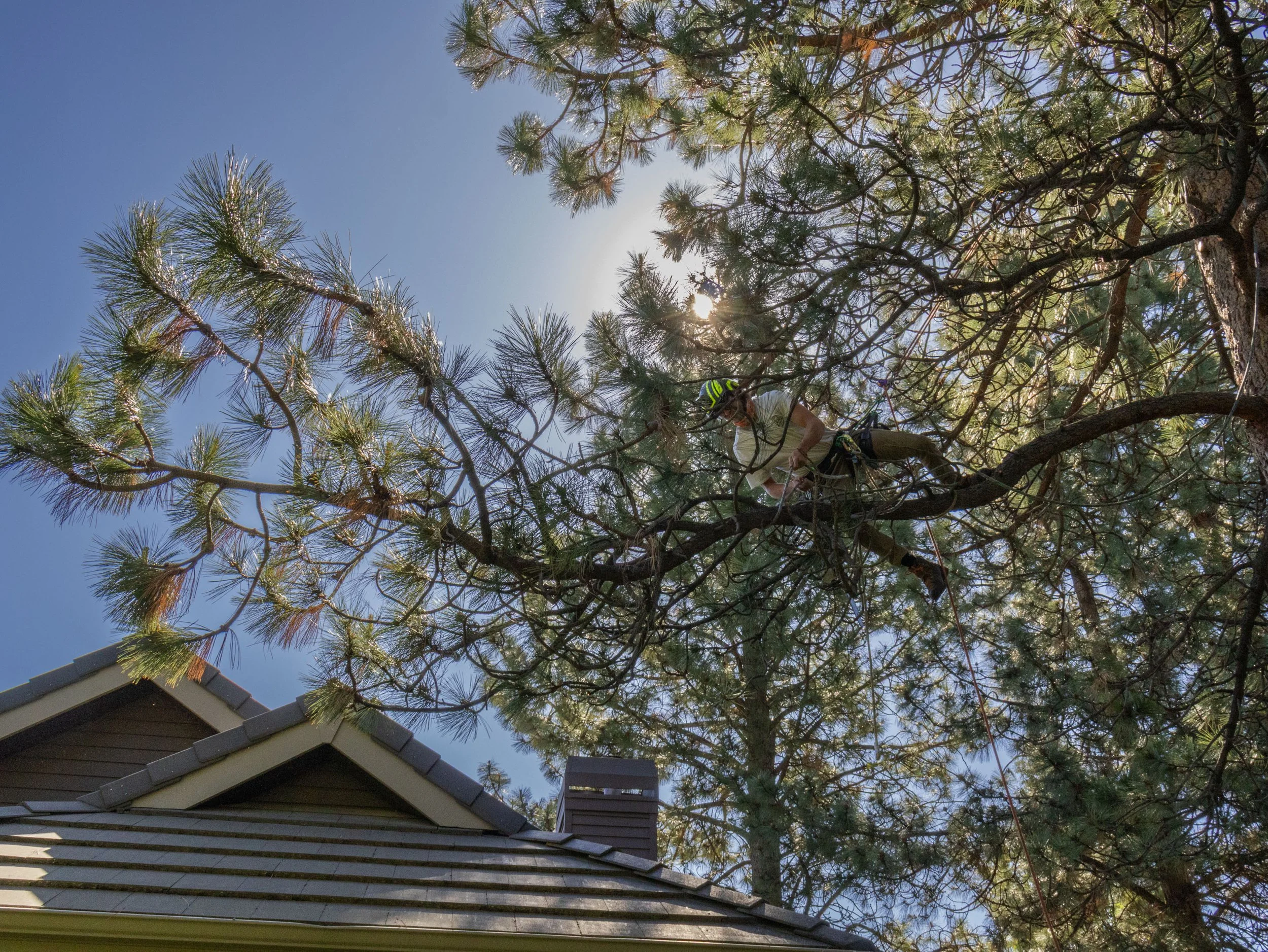
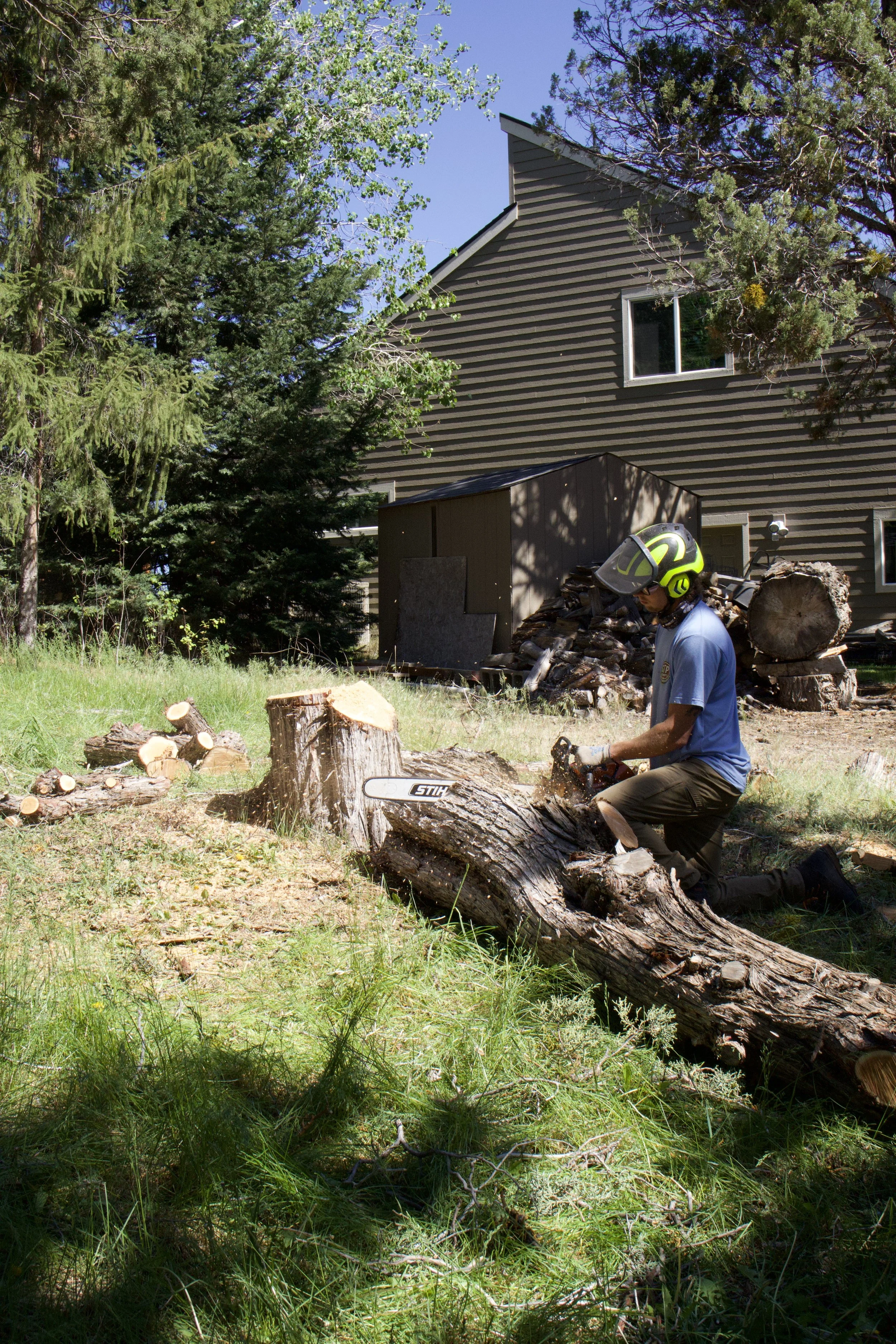
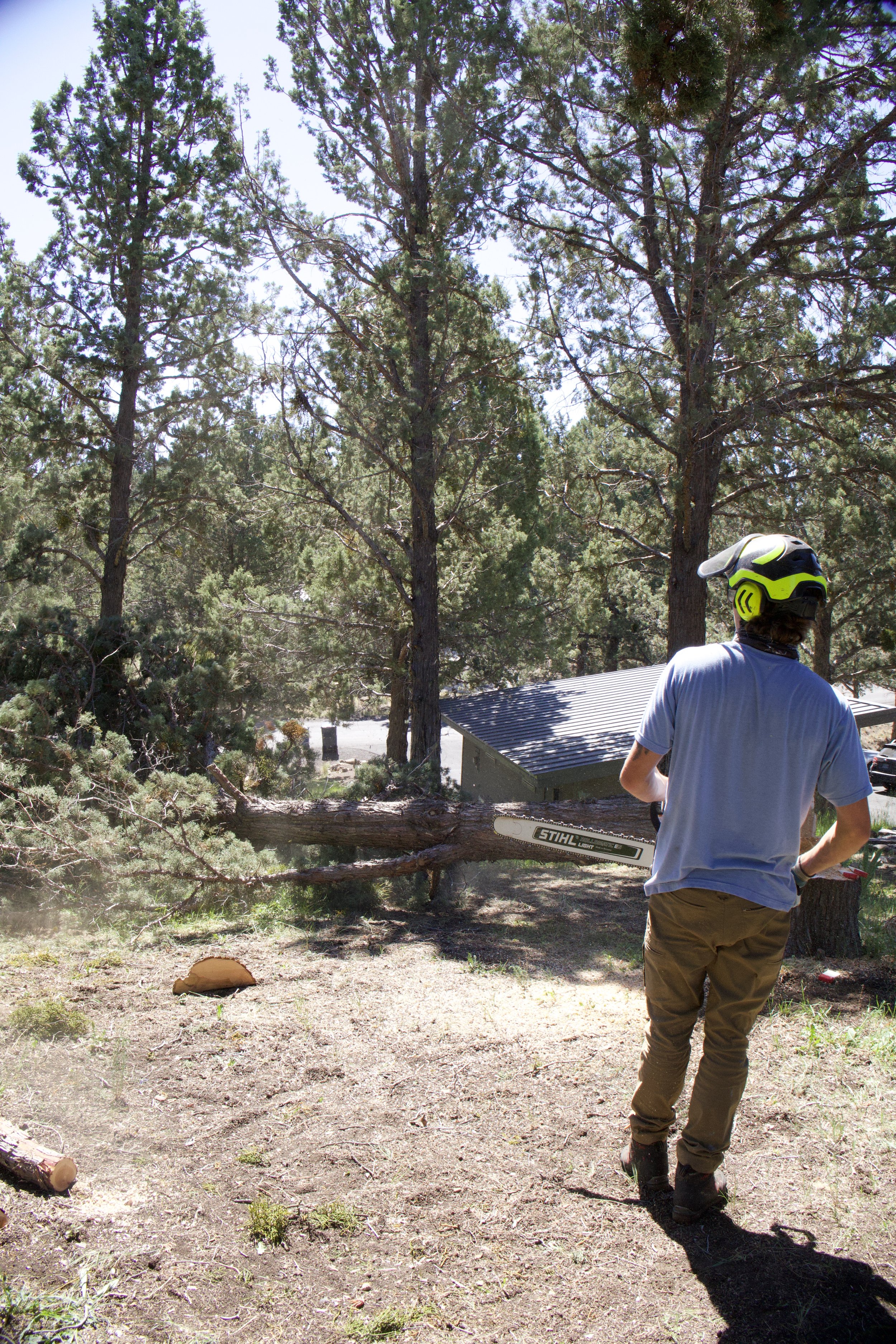
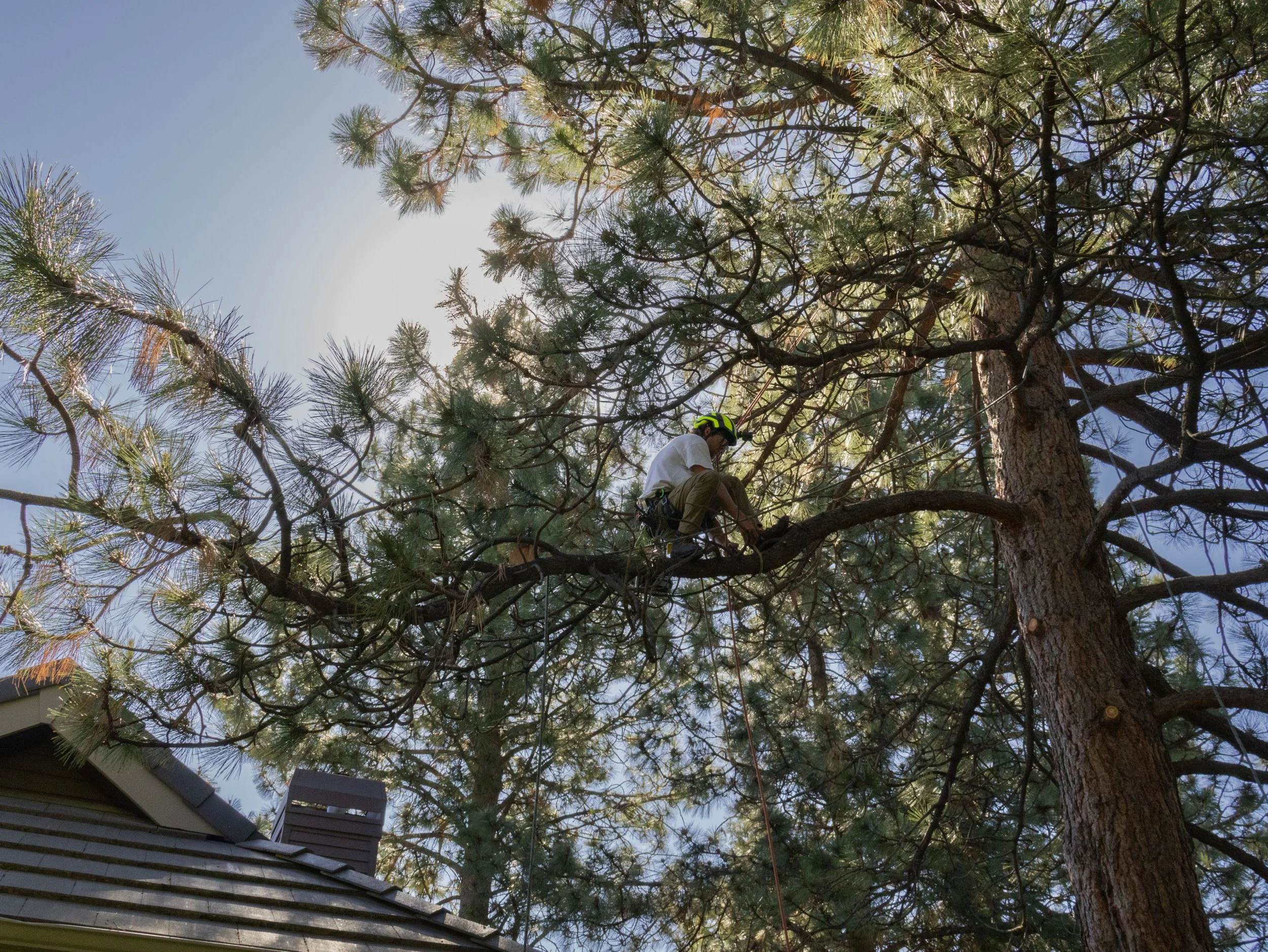
I photographed Nate on location in Central Oregon to create a library of authentic brand imagery for use across the company's website, email, social media, and promotional materials.
Rather than relying on generic stock photography, the images give STP a visual library that reflects the business’ people and work.
THE RESULT
STP now has a more cohesive visual system and a collection of flexible creative assets that can be used across its growing marketing presence.
Brand strategy → Design → Content → Photography
One project, end to end.